Friends, regular readers will be aware that I am very much in favour of electricity generation from renewable sources – primarily wind and solar. And the reason I am in favour of these sources of electricity is that they have very low associated emissions of carbon dioxide. So switching rapidly to these sources might allow us to continue to enjoy relatively cheap access to energy while reducing the possibility of catastrophic climate change.
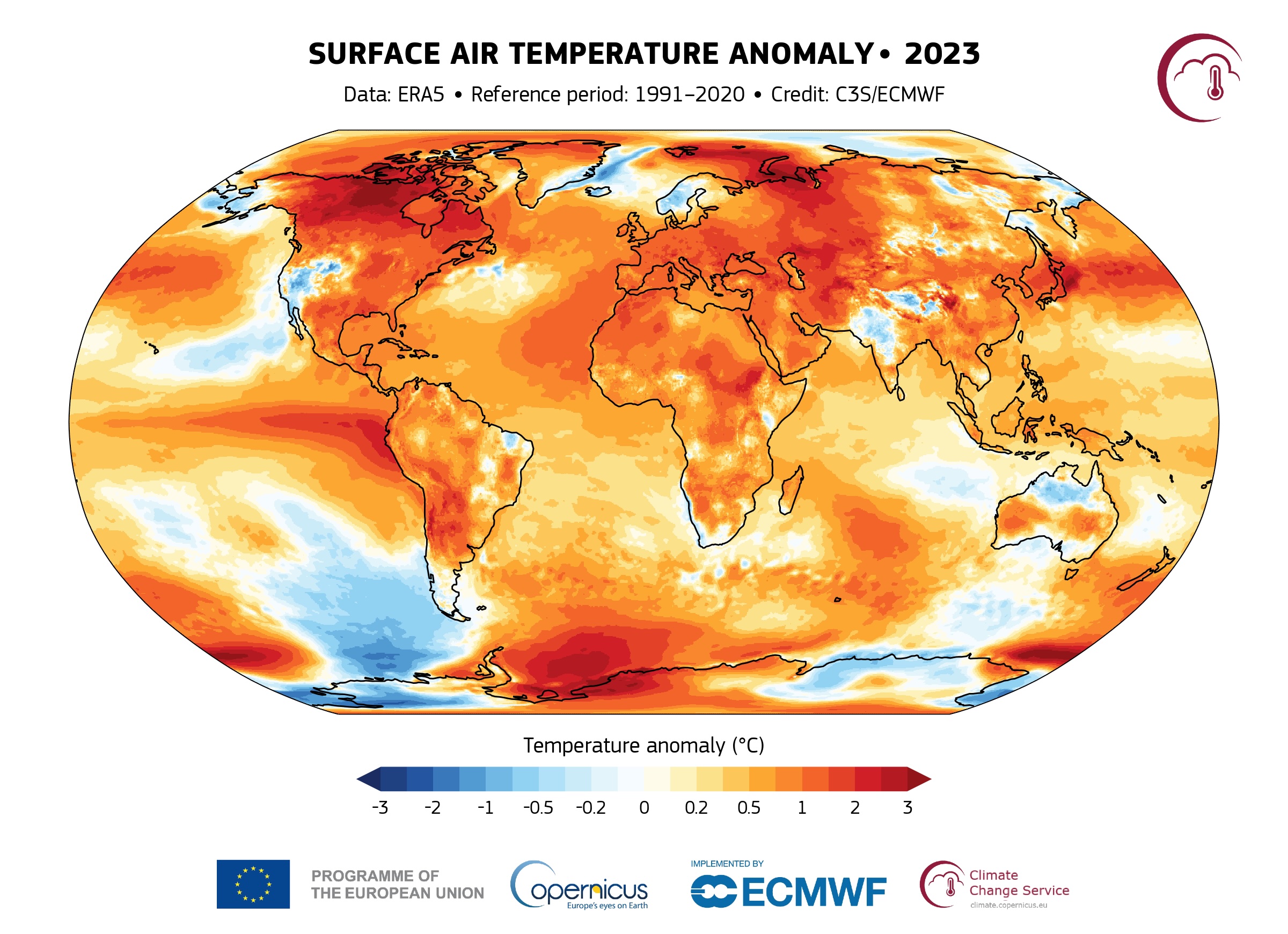
At the turn of the century it was thought that the fraction of renewable resources that could be incorporated onto the grid was rather small: between 5% and 10%. But that has not proved to be the case: last year the UK generated 37.2% of its electricity from renewable sources – more than it generated using fossil fuels (33.4%) (Link). This fraction will likely increase for the next couple of decades. But can it reach 100%?
I have been sceptical about this but considered that a grid with some high fraction of renewables (80% to 90%) would be not bad – and getting to this point would take a couple of decades, and that by that time we might have figured out how to close the gap to 100%.
Recently, I have become less sceptical and I now consider that a 100% renewable grid is possible. And so I thought I would write down my reasoning…
Models with less than 100% Renewable Electricity.
First there are simple models that take the existing hourly patterns of generation from wind and solar, and scale it by different factors.
For example MyGridGB has been running such a model for several years now, modelling how a hypothetical 2030 grid would meet current demand hour-by-hour. This is not a 100% renewable grid – but being near term it is a much more practical possibility. The assumptions are that:
- Hinkley C nuclear power station will come on line
- Nominal Wind capacity will be about 50 GW compared with 30 GW in 2023
- Nominal Solar generation will be around 40 GW compared with 16 GW in 2023
- Some biomass and gas but no coal.
- 100 GWh of electricity storage (Approx. 6x more capacity than Dinorwig and Cruchan hydro storage). UK grid battery storage is currently about 4.6 GWh.
These are sizeable upgrades but quite achievable and broadly in line with what is in “the project pipeline”.
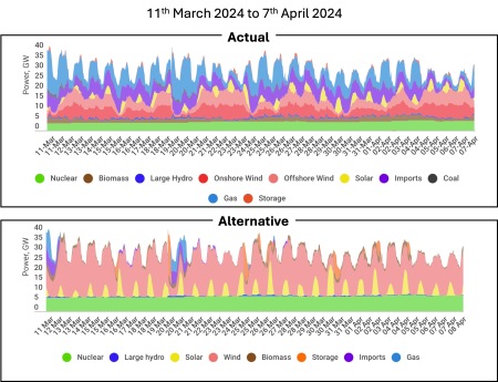
And the impact? Broadly this change would lower the annual carbon intensity of UK electricity to ~100 gCO2/kWh from its current ~200 gCO2/kWh. For example, the figure below shows how demand was met from 11th March 2024 to 7th April 2024 and how that same demand would be met with an improved grid.
C
The demand is exactly the same in both graphs, but notice the absence of blue (gas generation) from the lower graph. In this hypothetical low-carbon grid, gas generation would only be used rarely even in the relatively cold month of March.
Similar studies have been carried out for New Zealand, California and Australia, and for each country a different mix of solar, wind and storage is optimal. So for the UK we would choose a wind-weighted mix as opposed to California which would have a higher weighting of solar. These studies are helpful in showing the rough scale of endeavour required, and establishing the optimal mix of generating resources. But they are unrealistic for several reasons.
- Demand: They do not consider how electricity demand might change in the future. This requires estimating the increased demand as heating and transport become increasingly electrified. However, neither do these studies consider the effect of demand modification by variable pricing, which will generally reduce peaks in demand.
- Stability: They do not consider the stability of the grid as an electrical system. I’ll talk more about this below.
- Extreme Variability: And they do not consider the most extreme possible cases of variable renewable generation – weeks on end of low wind and solar generation.
So these models are useful for establishing the basic feasibility of grids with high renewable fraction. These models all feature some storage – but typically just a few hours of demand – not weeks-on-end of storage. And the amount of wind and solar generation is scaled not so that maximum generation meets demand, but so that minimum generation meets demand. This means that when renewable supply exceeds demand, the renewable energy must be used for something else, or curtailed i.e. just switched off. It is not yet clear what that ‘something else should be. Obvious candidates included charging batteries or some other form of storage – perhaps generating hydrogen for later use. But the economics of this kind of process are not yet clear.
Addressing Weaknesses
I have recently finished reading a lengthy review :”On the History and Future of 100% Renewable Energy Systems Research” which addresses some of the weaknesses of the simple models I have described above. This paper explicitly considers grids that are 100% renewable: i.e. no gas or coal.

Notable amongst the authors are Mark Z Jacobson and Auke Hoekstra. Jacobson is the author of “No Miracles Needed: How todays technology can save our climate and clean our air.” and Hoekstra has authored in-depth analyses showing the positive effects of electrification of transport – including the inevitability of the electric freight trucking.
The authors identify five criticisms concerning the feasibility of 100% renewable grids, and address each criticism directly.
- Energy Return on Investment.
- Variability and Grid Stability.
- Cost versus Conventional Grids.
- Raw Material Demand.
- Community Disruption and Injustice.
Criticism#1: Energy Return on Investment (EROI)
It has been asserted historically that the idea of a 100% renewable grid does not make sense because the energy required to construct the generation (PV and Wind) is less than the energy generated by the technology over its lifetime. Whatever justification this might have had historically, this is not the case now. Reasonable estimates suggest that the over their generating lifetimes:
- Solar PV installations have an EROI between 15 and 60.
- Wind turbines have an EROI between 20 and 60.
In other words they generate ~ between 15 and 60 times as much energy as it cost to build them. So the energy to construct these renewable generating resources is just a few percent of the energy generated. Initially, these resources may require fossil fuels to enable their construction. But as industrial processes electrify, and as the renewable fraction of grid generation increases, less and less fossil fuels will be required to construct each subsequent generation of renewable resource.
Criticism#2: Generating Variability and Grid Stability
It is a simple fact that much larger fractions of renewable electricity can operate on the grid than was anticipated even a few years ago. But can it reach 100%? The authors of this paper argue that yes it can, but the ‘new grid’ needs to operate with a new paradigm.
Historically generation consisted of ‘baseload’ generators that operated more-or less continuously, and so-called ‘dispatch-able’ resources that could be switched on at few moments notice from a grid control centre. To meet the new realities of a renewable grid, this “baseload plus dispatch-able generation model” needs to be revised.
The ‘New Grid” will probably not have a separate “baseload” category, and will incorporate more diverse sources of generation, international interconnections, storage, and demand response. So this new grid will certainly be more complex to manage, but the authors argue that given modern computing resources and engineering understanding, it is perfectly manageable.
To understand why the authors adopt this position, it is important to understand that although renewable resources are variable, they are predictable around two days in advance with reasonable confidence. As we approach a 100% renewable grid, use of gas generation will grow rarer and rarer. Initially the 100% renewable grid will only be achievable for at first days at a time, then weeks, then seasons, and finally whole years.
This progression will be the result of increasing solar and wind generation and increasing storage and the techniques for managing the generating will likely develop over a decade or so as the grid approaches 100% renewable electricity. But throughout this transition some gas generation is likely to be retained as back up for intermittent use. In terms of emissions, switching on gas-fired generation for 10 days a year will make very little difference.
The basic tools that will help the ‘New Grid’ to cope will be:
- Nominal oversizing of the wind and solar resources.
- Larger interconnections with geographically remote sources.
- Demand response
- Increased Storage
- Sector coupling i.e. using excess generation capacity for some useful purpose such as electrolysis of water to produce hydrogen.
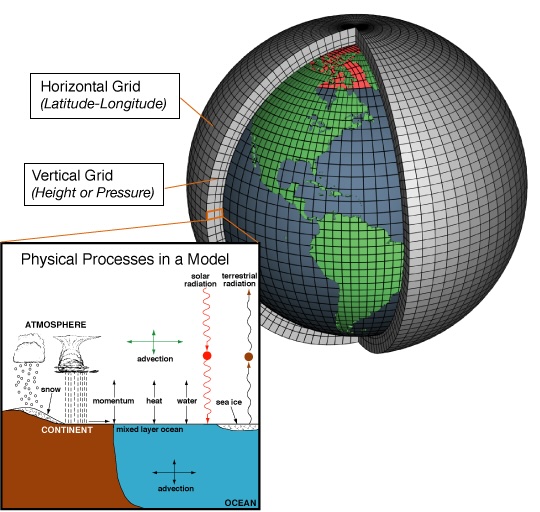
The issue of grid stability is difficult to explain, but allow me to try. The grid consists of alternating current (AC) sources of electricity in which electric current flows back and forth along wires 50 times per second. It is critical that all the sources on the grid operate in phase i.e. that every power source – no matter where it is in the country – ‘pushes’ electric current in synchronisation otherwise the power from each source will not add up.
Currently (no pun intended) this synchronisation is achieved because the rotating turbines in thermal power stations weigh hundreds of tons and rotate at high speed providing inertia to the grid.
- If more energy is drawn from the grid than is being supplied, the frequency of the grid falls fractionally and more sources are brought on line.
- Similarly, if more energy is being supplied than consumed, then the frequency of the grid rises, and generating sources are taken off-line.
Keeping the grid frequency stable and synchronising generation is critical to the safe and efficient operation of the grid. At the moment, the rotational inertia of generating technology additionally performs a stabilising role. But in a grid with 100% or near to 100% renewable sources, the inertia that keeps the grid stable needs to be deliberately added. This can achieved by rotating stabilisers or by so-called grid-forming inverters. This represents a change to the way the grid operates – but the challenge is neither insuperable nor particularly expensive.
Criticism#3 Cost
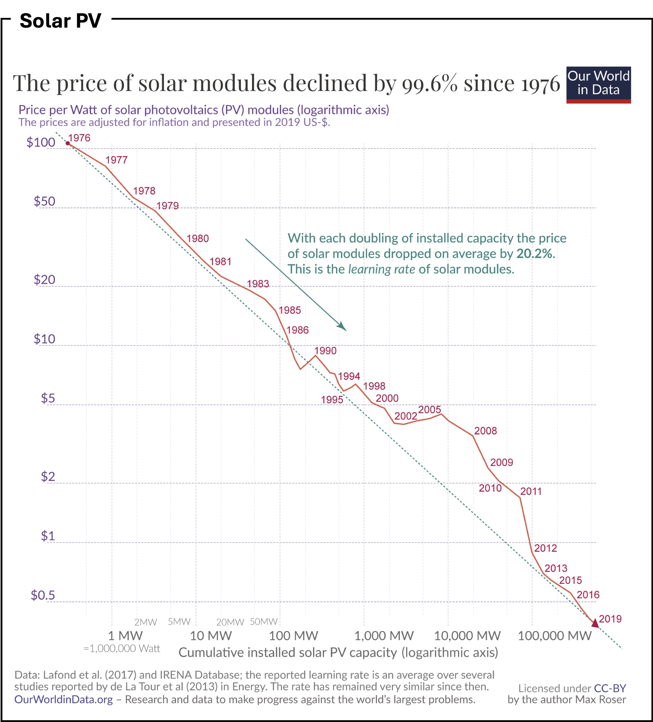
The cost of any large project is difficult to anticipate. But the authors point out that historical estimates of the the cost of renewable energy projects are significant overestimates because of the the effect of the learning curve. This is discussed extensively in this 2020 article by Max Roser on Our World in Data. And the cost reductions in renewable technologies have been staggering, and contrast dramatically with the cost increases in competing spheres, such as nuclear generation.
The three graphs below show the price reductions in batteries, solar PV cells, and all generation technologies. In the face of this, the authors argue that realistic incorporation of the effects of the learning curve result in cost estimates that are cheaper or at least competitive with conventional generation. And of course, the cost of business-as-usual in terms of damage to our climate is not considered. Taking account of this, a renewable grid is a no-brainer.

Click on image for a larger version. Graphic from Our World in Data showing the reduction in the price of Lithium Ion Batteries versus year. I have extended the trend to illustrate what is yet to come. Price cuts are still ongoing.

Click on image for a larger version. Graphic from Our World in Data showing the reduction in the price of solar PV modules which are combined into solar panels cumulative installed capacity. Price cuts are still ongoing.

Click on image for a larger version. Graphic from Our World in Data showing the change in the price of the Levelled Cost of Energy (LCOE) for a variety of generation technologies versus their installed base. Notice that renewable technologies tend to get cheaper as their installed base increases.
Criticism#4: Raw Materials Demand
Criticisms of a renewable energy grid often highlight the raw materials needed to construct the batteries, solar panels and wind turbines. While there will no doubt be issues as we scale up to a renewable energy world, the amounts of materials involved are small compared with current demands, and are dwarfed by the amount of oil and coal currently mined. Of course, oil and coal are high polluting and can only be used once: the metals mined for renewable technologies can all be recycled. For scale, the graphic below shows the scale of mining in 2022.

Click on image for a larger version. Graphic from The Visual Capitalist illustrating the relative mass of metals mined in 2022.
Attention is often drawn to the use of particular minerals, particularly cobalt (used in the first generation of lithium-ion batteries used for TVs) and so-called rare-earth metals Neodymium and Dysprosium used in the magnets incorporated into some motors and generators. Personally, I think these are non-issues.
The use of cobalt as a catalyst in oil-refining was never an issue until cobalt began to be used in EV batteries. Happily, modern lithium iron phosphate batteries do not use cobalt, but sadly, cobalt is still being used to manufacture the fuel for internal combustion engine vehicles. Similarly, the latest motors from Tesla avoid the use of any rare-earth magnets.
Criticism#5: Community Disruptions and Injustice
Friends, community disruption and injustice are sadly features of our modern world. And they have been for centuries. And these issues are real and serious. But that people wanting to extend the life of fossil fuel extraction – the cause of catastrophic climate disaster – should address such criticism against renewable energy projects is – frankly – laughable.
Summary
So can we build a grid with 100% renewable sources? In short, yes, I do think it’s possible.
The ‘New Grid’ will not be identical to the ‘Old Grid’. And it will have weaknesses, particularly in its early decades. Most notably, until interconnections extend between continents, it will be vulnerable to – for example – volcanic events such as occurred in 1816: ‘The Year without a Summer‘. However, it will be less vulnerable than our current grid to hostile geopolitical situations which restrict the availability of key fuels. It is an arguable which of these possibilities might be considered more likely.
But the overwhelming advantage of a 100% renewable energy grid is that directly addresses our climate crisis. Is there an alternative? The only plausible alternative is a grid based on nuclear power, but given our collective inability to safely dispose of the nuclear waste we have created over the last 50 years, and the extremely high cost of nuclear generation, I simply cannot see this happening. In contrast, progress towards a future based on renewable energy is proceeding at an ever accelerating pace.