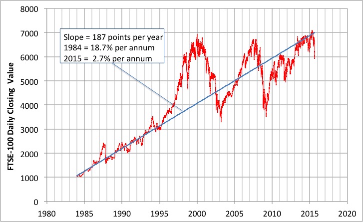
Daily Closing value of the FTSE-100 Share Index from 1984 to 2015. Data is from Yahoo!. The straight line is a guess at a ‘trend’. Click for a larger graph.
While relaxing on holiday in Northumberland last week, I received a blog comment on an article I wrote in 2011 on Trends in the FTSE 100 share index.
As the FTSE 100 hovers around the 6000 mark again, it would be interesting to see an update to this graph.
That seemed like a good idea to me too. So:
- I popped over to Yahoo! to look up historical FTSE-data
- I looked up a strange site recommended by Google that had historical inflation data in a convenient format.
And I put them together to produce two graphs.
Graph 1
The graph at the head of this article shows the daily closing value of the FTSE-100 share index from 1984 to August 2015.
- Very roughly – the data can be represented by a straight line from 1984 up until 1995
- From 1995 to 2013 the share index performs two giant multi-year boom-bust cycles.
- From 2013 the data appear to return to the previous trend line! Well, at least up until the recent drop from around 7000 to 6000.
You might take this to vindicate the common wisdom that the Stock Market will return steady growth when considered in the long term.
However, even if the index has returned to ‘trend’ this represents something very different now from 1984.
- In 1984 this ‘trend’ investment returned 18.7% per annum growth.
- In 2015 the ‘trend’ growth is only 2.7% per annum.
Of course long-term ownership of shares will additionally have resulted in the payment of annual dividends, but nonetheless it is interesting to see the index in its long-term context.
Graph 2
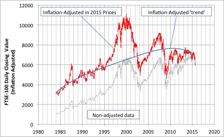
Daily Closing value of the FTSE-100 Share Index from 1984 to 2015 adjusted for inflation to 2015 prices. Data is from Yahoo. The straight line ‘trend’ shown on the first graph is also shown adjusted for inflation. Click for a larger graph.
The graph above shows the data from the first graph adjusted for inflation indicating the value of the FTSE-100 index in 2015 prices.
Also shown is the inflation-adjusted ‘trend’ line from the first graph.
The data tells the same story as before except that now it looks like the recent ‘return to trend’ actually represents a consistent decline in value.
Looking at the longer term, adjusted for inflation, the FTSE-100 had its current value of around 6000 in 2009, 2003, 1995 and even briefly in 1987.
And the lesson is…
Back in 2011 I concluded by saying:
- Whatever process the data represents made sense up until the mid-1990’s. Since then it doesn’t look like there is any kind of consistent trend for more than a few years.
- Based on this data, it would be rash IMHO to place a bet – perhaps using all the money in one’s pension fund – on the value of the index in (say) 20 years.
- Shares can go up as well as down. Or up and down as well as down and up. I am not a registered Financial Advisor
Looking at this updated data I don’t see anything to make me change my mind.
If one takes into account the dividends generated by shares then you may look at stocks with a different perspective, but hoping for gains in the index itself looks to me to be an unwise basis for investment.
Have I missed something? If you think I have, please let me know.
Tags: FTSE100

August 31, 2015 at 1:52 pm |
Total returns depend on whether dividend income is reinvested.
August 31, 2015 at 5:22 pm |
Yes, good point. Perhaps I should also have compared a simple compounded interest at some historically typical rates. Perhaps on the next bank holiday Monday.
M
August 31, 2015 at 8:13 pm |
I’ve been told that the amount given in dividends in the recent era is much larger than it used to be. I suppose this is easy to check with the right website. It looks to me that the 1st 2 eras are typical of feedback systems i.e. growth and oscillatory. The most recent wobbling is still fairly consistent with oscillation with some kind of large external input (e.g. big change in regulation, etc). Have to wait 10 years to see…