Archive for August, 2014

GCSEs, A levels, and degrees: Another Perspective

August 28, 2014

My friend Bernard Naylor commented on the last article and his comments seemed insightful and considered. So I thought they deserved re-broadcasting away from the ‘invisible’ comments section.

Bernard wrote:

The best thing to do with GCSEs is to abolish them as the school-leaving age is being raised to eighteen. The education of our children, and the children themselves, suffer from too much external examination and assessment. (Schools should of course be conducting assessments internally as an ongoing duty – as no doubt they mostly are.) Other countries, with more successful education systems manage without this incessant micro-management from a government department.

I think this is a fair point, and amplifies this recent Guardian article. Given the current mess, it is hard to argue against this, but I am still unconvinced.

If the abolition of GCSEs were coupled with a proper recognition that both academic and vocational training were important then I can imagine benefits at both ends of the academic ability range.

But this is a difficult balance to achieve and has been screwed up before. And until a clear alternative (???) is proposed that addresses current failures, I would prefer to stick with the status quo.

Why? Because one of the major problems with educational policy has been that it has not remained the same for more than a couple of years at a time – and this endless change is  in itself demoralising and counter-productive.

On no account should the government be setting syllabuses. It is a recipe for political interference with education. It may just about be OK in Physics, but in English Literature and History (for example), the recently departed Secretary of State has been having a pernicious effect, with (among other faults) too much harking back to what was OK when he was at school, donkeys years ago.

There should be independent statutorily established bodies with responsibility to determine overall course content and educational objectives – and professional teachers should be trusted much more at the detailed level. The function of the inspectorate should be one of monitoring and mentoring, It’s just a short time since Ofsted decided that ‘Satisfactory’ actually meant – well – unsatisfactory! Every school has room for improvement. Giving any school a judgment that doesn’t imply that is simply wrong. We can all get better!

And I entirely agree with you about the lunacy of having ‘competition’ in the examination system.

I think that is what I meant to say. My key point is that there should be only one body setting exams.

Publishers should compete to publish good books and other learning resources.

Just a final point about universities’ calibration of examination marking, which of course I watched quite closely, from a detached standpoint, for about a quarter of a century. If anything above 70% is a first, and anything below 30% is a fail, that means that 60% of the calibration scale (i.e. above 70 and under 30) has no meaning. Calibration being one of your strong points, can you possibly justify that? I never heard a reasonable defence of it from any of my teacher colleagues!

Let me try to defend it. At the top of the scale there were occasionally students – less than one a year at University College London – whose average mark was above 90%. Such students were truly exceptional.

Although these ‘90%-students’ shared a degree classification with ”70%-students’ – the range of the scale allowed their exceptional abilities to be noted – and I promise you, their abilities were noticed!

At the bottom of the scale, one simply needs to pick a level represents ‘this student hasn’t got a clue’. Picking 30% – or 35% at UCL if I remember correctly – is arbitrary. Arguably it should be higher.

And talking of ‘academia’, one thing that impressed me during my academic career was the care taken in Exam Board meetings. I don’t think students had a clue that every single student’s mark and performance was considered – often at great length.

And the key question asked was whether the mark made ‘sense’. In other words, the Exam Board used the exam results as an aid to judgement – and not a substitute for it. It was very rare for the board to change marks – that would in general be unfair. But where fairness demanded it, we did it.

GCSE and A level exams: parental reflections

August 25, 2014

My two sons have just received the results of their ‘A’ level and GCSE exams. Thank you for asking: both did very well.

My elder son will be off to Bristol University to study Civil Engineering, and the younger son will be moving into the sixth form of a nearby school.

Parentally, I am vicariously proud. But mainly relieved.

Here are my reflections.

GCSEs

GCSEs are a mess. They are both too easy and too hard.

Too easy? Yes  –

  • My son got 100% in 5 exams. He is good, but not perfect!
  • He achieved A* in Music – the only child in his school to do so – but he is still being asked to study additional music theory to be allowed to continue to ‘A’ level music.
  • Similarly, A* in Maths is not sufficient to allow to him to study Further Maths.

In athletic terms it is as if sporting adjudicators simply refused to raise the bar in a high jump to find out just how high athletes could jump.

Too hard? Yes: Anything less than a grade C is counted as a ‘failure’ thus effectively categorising around 30% of students as failures and providing no opportunity to for them to demonstrate their abilities.

By ‘30% of students’ I mean one in three of us – the people who live in England and Wales. Do we really believe they are ‘failures’?

In athletic terms it is as if even the lowest setting of the high jump bar tripped up every third athlete.

Too Easy and Too hard? If we compound this fundamental problem with the way fluctuations in the results are used to attack teachers and schools then we have a recipe for dysfunction.

For the last year the majority of my son’s lessons focussed on passing exams, not on details of the subject under study. This has definitely helped his marks and helped the school, but has done nothing for his enthusiasm for the subjects he has been studying.

From a parental perspective I am just glad to be no longer involved.

‘A’ levels

One important purpose of ‘A’ level courses is to prepare students for University or other further study: they are not usually an end in themselves.

And the purposes of the grading system is to discriminate amongst the students, and in particular to discriminate amongst the most able students.

The problem is that – in Physics at least – the syllabus has been reduced and and there has been around two decades of grade inflation.

As a consequence many universities ask for A* grades. 

However  the grade A* needs ‘almost perfect’ marks – which requires a very particular kind of student and programme of study. In contrast, at University, a course average mark of around 70% is usually sufficient to gain a first class degree.

My thought is that ‘A’ levels are certainly challenging, but they are not challenging enough. And the marking scheme needs to change.

Marking

I have said this before, but please forgive me if I say it again: we need to change how we grade exams.

Efforts to ‘maintain standards’ from year to year to year to year are – regrettably – laughable.

Maintaining standards’ in the face of a changing syllabus is impossible and probably meaningless.

My suggestion is this: the grades A*, A and B should reflect only the ranking order of the student.

For example:

  • A* should indicate that a student is in the top (say) 5% of the student body. It is possible for this to have the same meaning from year to year
  • A should indicate that a student is in the next 10% of the student body. It is possible for this to have the same meaning from year to year.
  • B should indicate that a student is in the next 10% of the student body. It is possible for this to have the same meaning from year to year.

After this there could be grades in which the fraction of students can change – perhaps they should be called a merit or a pass.

The percentage of students who ‘pass’ would be allowed to change to allow more students to pass should teaching standards change

But the purpose of exams is to assess students. It is (IMHO) invidious to use exams for the additional purpose of judging schools and teachers.

It may be reasonable to use a school’s or teacher’s exam results as an aid to judgement of a school or teacher – but hateful to use the results as a substitute for judgement

Our schools are full of hard working and inspiring teachers who are continuously being worn down by perennial threats. We should be supporting and not threatening these precious souls.

The Scandal

The scandal is that the government has outsourced the entire exam system to a number of bodies entirely controlled by multinational publishing companies.

By controlling the syllabus and exams the publishers create a ‘market’ for their text books in which no other company can compete. This is very profitable, but not obviously in the interest of the students.

IMHO the government should write the syllabus for exams and a single independent body should write the exams. We do not need ‘competition’ between publisher-owned exam boards.

Publishers should then compete with each other, without insider knowledge, to create the best text books that teach the subject – and not how to pass ‘their’ exams.

This would drive down the cost of both exams and text books and end the current ‘almost corrupt‘ system

Personally I can’t wait to have nothing more to do with the system.

How hard did it rain last week?

August 22, 2014

Hardcore Protonistas – and that’s you if you are reading this – will know that I love measuring things.

I love the way that measurements allow an extra level of wonder at the intricate detail of the world around us.

The rate of rainfall at NPL Teddington on 14th August 2014. The rainfall rate initially exceed 100 mm per hour. The first event resulted in 28 mm of rain and the second 18 mm of rain.

The rate of rainfall at NPL Teddington on 14th August 2014. The rainfall rate initially exceed 100 mm per hour. The first event resulted in 29.3 mm of rain and the second 18.4 mm of rain.

Last Thursday 14 August 2014 there were two torrential rain events at NPL.

They were kind of event that makes you stop what you are doing, go to the window and just stare. Personally they evoked memories of my childhood home and the security of being indoors and protected.

All very nice. But how much rain fell? And was it exceptional? These questions can only be answered by looking at data.

So I downloaded data from a weather station on the roof of one of NPL’s buildings. The graph at the top of the page shows the key features of the data.

  • In both events the rate of rainfall was initially over 100 millimetres per hour
  • The first event deposited 29.3 mm of rain and the second 18.4 mm of rain.

These data show that these were indeed powerful weather events.

Over the main NPL site, which comprises approximately 400 m  x 100 m = 40,000 square metres, the first event result in the deposition of approximately 1160 tonnes of water in approximately 50 minutes. Wow!

But were the events exceptional? The Met Office keep a record of extreme weather events (Link) which states that the most extreme UK rainfall events have been:

  • Highest 5-minute total: 32 mm on 10 August 1893 Preston (Lancashire)
  • Highest 30-minute total: 80 mm on 26 June 1953 Eskdalemuir (Dumfries & Galloway)
  • Highest 60-minute total: 92 mm on 12 July 1901 Maidenhead (Berkshire)

Assuming these historic measurements are indeed reliable – which is not always the case – then the events in Teddington last week  were not technically ‘extreme’.

However they were astounding – and in the very best sense of the word – wonder-ful.

Would you like to measure the surface temperature of the Earth?

August 18, 2014
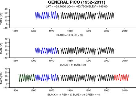
Our estimate of the global mean temperature is derived from analysis of around 30,000 individual station records such as the one above. This graph shows how a single station record must sometimes be pieced together from fragmentary data in in different holdings.

Our estimate of global mean temperature is derived from analysis of around 30,000 individual station records such as the one above. This graph shows how a single station record must sometimes be pieced together from fragmentary data in different holdings. Data from Geoscience Data Journal 30 JUN 2014 DOI: 10.1002/gdj3.8

Every few weeks an e-mail filters through to me from NPL’s web enquiry service. One arrived last week:

  • We seem to be taking far reaching conclusions (climate change) from temperature measurements taken around the world over the last 300 years. Taking into account the geographic spread of such readings and the changes in methods of measurement over the years is this scientifically robust?   

I wrote a rather long-winded  reply which you can read below, but after I sent it I realised I had forgotten something: I could have invited the enquirer to work out the answer for themselves!

That might have been a bit cheeky, because it is not a simple task. However, the data is freely available and its provenance has never been better established than in the databank released by the International Surface Temperature Initiative (ISTI).

ISTI is an effort to which I have myself contributed minimally by sitting on its steering committee and occasionally answering questions related to calibration and the fundamentals of temperature measurement.

The motivation for ISTI was to make sure the entire databank was publicly available. This was back in 2010 when global warming sceptics were claiming that the global warming was a hoax. Since then sceptics have changed to believing all the data and claiming its fluctuations are of profound significance. In any case, making the data publicly accessible and free allows even small research groups – or even you if you are not too  busy – to make their own analyses.

The paper linked here describes the structure of the databank and the way it has been constructed. It is a long paper and here I only want to draw your attention to the detailed scrutiny paid to every station record in the 30,000 records.

Each station record has a latitude, longitude and altitude associated with it. But one needs to decide whether a short record from one source is a unique record – in which case  it must be included – or  a duplicate of some fraction of a nearby station. Alternatively – as the graphic at the top shows – different parts of an individual station record may be available – possibly with mis-spelt names – in different data holdings.

This kind of analysis is tedious in the extreme, but is actually essential in creating a databank that people can trust. I am filled with admiration for the achievements of my ISTI colleagues. Now anyone can work out the surface temperature of the Earth for themselves.

So what are you waiting for?

================================================================

My Reply to the NPL Enquiry

Hello. I am an NPL scientist specialising in temperature measurement. Amongst other claims to fame, I have made the most accurate temperature measurements in human history, and also sit on the steering committee of a group (http://www.surfacetemperatures.org/) that has established an open-source data base of surface temperature records. And I have been asked to respond to your message which reads.

  • We seem to be taking far reaching conclusions (climate change) from temperature measurements taken around the world over the last 300 years. Taking into account the geographic spread of such readings and the changes in methods of measurement over the years is this scientifically robust?  

The short answer is ‘Yes, it is scientifically robust’ but it is not at all obvious that it should be so.

Let me give a slightly longer answer.

You are quite right to be concerned but in fact the data are analysed in a careful way which we believe eliminates most (if not all) of the inevitable distortions of the data.

First of all, the data

Typically this consists of twice daily readings of the maximum and minimum temperatures taken inside a Stevenson screen. Typically these are average to produce a daily ‘average’ and this is then further averaged to produce a ‘monthly mean temperature’. Because of this averaging the monthly mean temperatures have rather low variability and enable trends to be seen more easily than might be expected.

This met office web site shows typical data from the UK http://www.metoffice.gov.uk/climate/uk/stationdata/

Secondly, the analysis.

The monthly mean temperature data from around the world has been analysed by four different teams and – very substantially – they all agree that the air temperature above the surface of the Earth has warmed substantially in the last century. One key part of their analysis is that data from a station is compared only with itself. So we look back through a single station record and ask “Does it have a rising or falling trend?”. If life were simple – which it never is – all we would have to do would be to extract the trends and average them over the correct area of Earth’s surface. But life is never simple.

As one look’s back through a record one sees many ‘glitches’ or sudden changes, and typically there is no explanation for why they occurred? Were they real? Should we leave the glitch in the data? Or try to correct it? And if we correct it – which way should we adjust the data? Typically these glitches occur when an instrument is changed, or when a station is re-sited e.g. from one side of an airfield to another. Different teams take different approaches, but all of them take great care not to distort the data.

Let me give you one example. This is called the Pair-wise Homogenisation Algorithm (PHA) and works especially well in places such as Europe or the USA where there are a high density of weather stations. Since we are looking for a signal of ‘climate change’ we would expect this to show up on all station records in an area a few hundred kilometres across. So if we detect a glitch – we can compare that individual record with all nearby station records one pair at a time. In this way we can see whether the glitch is real or just affects that one station. And we can correct it if we choose to. The PHA can also  detect the so-called ‘urban heat island’ effect.

Thirdly, geography.

So the PHA can allow us to extract a trend from around 30,000 weather station data records. But these are not distributed uniformly around the globe, and critically Africa and the poles have relatively short data records. Nonetheless, based on reasonable assumptions, the warming trend does seem to be widely distributed.

And finally.

The weather records that we have were not compiled for the purpose of climatology, but we have adapted them for that purpose. But we can look at other records, such as the dates of first blooming of particular flowers. This data is not so easy to interpret but also is much less prone to numerical manipulation. And critically we can look at the extent of the melting of artic sea ice. Many different things we measure tell a story of warming that is consistent with what we would expect from carbon dioxide emissions.

The Berkeley Earth Project web site http://berkeleyearth.org/ has particularly nice graphs and is well organised if you would like to investigate this question further.

If you have any remaining questions, please don’t hesitate to contact me.

Michael
********************************************

Dr. Michael de Podesta MBE CPhys MInstP

Principal Research Scientist
National Physical Laboratory
Teddington, TW11 0LW
michael.depodesta@npl.co.uk
Telephone 44 (0)20 8943 6476
********************************************


Sine qua non

August 11, 2014
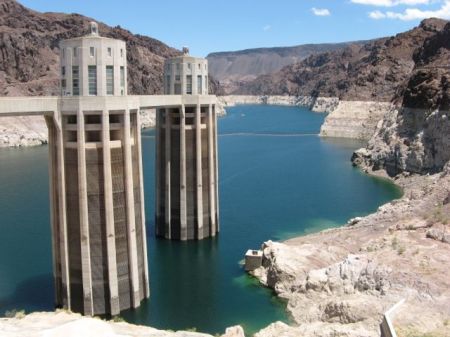
The view of Lake Mead from the Hoover Dam. The water level is 36 metres below its level at the time of my last visit in 1986.

The view of Lake Mead from the Hoover Dam. The water level is 36 metres below its level at the time of my last visit in 1986. The two towers are structures around the intakes for water extraction and electricity generation.

During my recent holiday in California I received NASA’s Natural Hazards ‘weekly update’. It arrived on my phone while I was in Los Angeles, relaxing by a gurgling water feature.

The following sections have been updated in the past 7 days.
————————————————————————

— CROPS AND DROUGHT (1 updated events, 1 new images) —

DROUGHT IN THE WESTERN UNITED STATES
A serious drought settled over California in early 2014.
* http://earthobservatory.nasa.gov/NaturalHazards/view.php?id=84065&src=nha
 *** Image from Jul 07, 2014 (Posted on Jul 23, 2014 4:32 PM)

———————————————————————
Natural Hazards is a service of NASA’s Earth Observatory.
http://naturalhazards.nasa.gov/ http://earthobservatory.nasa.gov/

I was shocked to find that I was apparently on holiday in a ‘natural hazard’.

The e-mail highlighted recent research that tried to assess the net long-term reduction in water resources in the Western US, including not only above-ground reservoirs but also underground water. The basin of the Colorado river is apparently down by 65 cubic kilometres in the last 14 years. It may seem unnecessary to say – but a cubic kilometre is a truly phenomenally large amount of water!

These measurements – based on detection of minute changes in the gravitational effect of ground water on satellites (!) – are very difficult. And so it is hard to know exactly how much one should trust their detailed conclusions. But their general conclusion seems pretty sound: California is drawing on its water resources at a faster rate than those resources are being replenished.

This is news to nobody. While in California we saw many adverts and heard radio anouncements urging water conservation. Even amongst the extravagance of Hearst Castle, there were no fountains, the swimming pools were empty, and the toilets were replaced by chemical toilets

Sign on the door of the Hearst Castle Visitor Centre, near San Luis Obsipo, California

Sign on the door of the Hearst Castle Visitor Centre, near San Luis Obsipo, California

But nothing conveys the magnitude of the problem more powerfully than the declining level of the largest reservoir in the US: Lake Mead, trapped behind the Hoover Dam.

Since my previous visit in 1986, the level of water in the 600 square kilometres of Lake Mead has fallen by approximately 36 metres, representing the loss of 21 cubic kilometres of water storage. The lake is now less than 40% full.

Graphing the elevation above sea level (in feet) of the surface of Lake Mead. The 'error bars' shows the annual variation. WHen the level reach 1075 feet, water withdrawals will be automatically scaled back.

The elevation above sea level (in feet) of the surface of Lake Mead versus year. The ‘error bars’ shows the annual variation. When the level reach 1075 feet, water withdrawals will be automatically scaled back. The fall in 1965 resulted from reduced inflows due to the filling of an upstream reservoir – Lake Powell. Click for a larger version.

This level represents the balance between the water drawn from Lake Mead, and the inflows from snow-melt in the Colorado mountains.

Inflows to Lake Mead are typically 10 cubic kilometres annually but annual outflows have been around 11 cubic kilometres.

The low level of Lake Mead in some ways represents a triumph – this is why the Hoover Dam was built: to allow water users to be able to rely on water being available through a drought.

But the prolonged decline results from poorly-drawn water ‘rights’ that allow states to withdraw water at a rate exceeding the long-term average.

When the level reaches 1075 feet – the red line on the graph – then water restrictions will be automatically implemented and presumably the level will stabilise and hopefully recover.

What struck me powerfully on my visit to Las Vegas and the vast metropolis of Los Angeles was that water is the sine qua non of civilisation. And these cities have been built in a natural desert.

Of course all that is required is a reduction in water usage, which will probably equate to an increase in the price of water.

It is hard to see how this situation will evolve – but the first rule of futurology is that the future is likely to be similar to the present day, but different.

And perhaps all that it will take is for the growing of crops less suited to the desert (such as rice!) to move to other parts of the world.

Live Fish; Live Music; The importance of being there.

August 1, 2014
This picture shows a gigantic tank of jellyfish with people silhouetted in the foreground. Picture taken at teh MOnterey Aquarium, California.

A gigantic tank of jellyfish with people silhouetted in the foreground. Picture taken at the Monterey Aquarium, California.

I hope you like the picture above. As you look at the picture you probably can’t tell if the vivid colours are on a screen or whether I took the picture of people in front of  a real tank of jellyfish

But I was there. And the jelly fish were very real.

I gazed in open-mouthed wonder at the delicacy of the structure of their bodies. And I desperately wanted to capture something of the experience.

Now when I look at the picture I recall that feeling of wonder but I don’t really know what you feel.

Two musicians playing Jazz at 'The Melt' a small cafe on Columbus AVenue, San Francisco.

Two musicians playing Jazz at ‘The Melt’ a small cafe on Columbus AVenue, San Francisco.

The picture above shows two musicians who happened to start playing at ‘The Melt’ on Columbus Avenue in San Francisco just after we stopped in for a snack. As you look at the picture you probably wonder what they were playing or if they were good.

But I was there. I remember being so happy that we had chanced upon this place.

And I remember my son’s happiness when we all recognised the beginning of ‘So What’ by Miles Davis. I left a $5 tip for them.

I mention these two occasions because  as I looked at the photographs I realised that the photographs did not capture my happiness or wonder.

And I just thought I would make a note – largely for myself – about how pictures communicate something – but what they communicate is not always the experience of the photographer.

And that there is really no substitute for ‘being there’.